

|

Part III - How to Take Pictures of BooksNow and again, I sell Rolex watches on eBay. Even though these are high end items, competition for buyers is usually keen. List a $3,000 or $4,000 watch, and there's a good chance you'll be competing head to head with a half dozen or more identical watches. Given this kind of situation, you'd probably assume that final values don't vary much, and to a large extent this is true. Most watch dealers are reputable and most provide fairly clear descriptions and pictures. If a buyer is looking for a particular Rolex model and gets outbid on auction A, it's no big deal because he knows that there are auctions B through F to bid on too. If those don't pan out, well, he waits a week and there will be half a dozen new ones. What this does is promote rational bidding. There's no urgency, no getting caught up in the heat of an auction. Prices stabilize. Usually. Occasionally, however, watches reach higher final values, sometimes unusually high. This is the kind of thing you notice - and puzzle over - when you're battling other dealers for buyers. It can get discouraging when another seller makes hundreds of dollars more than you do on an identical watch. Obviously, any number of factors can play into this - timing, feedback, luck, etc. - but having studied these auctions for some time and also improved and refined my photographic skills, I've come to the conclusion that only one factor consistently prevails in exceptional auctions: an exceptional picture. Since a watch is a small object and condition issues are hugely important, a clear, close-up picture is necessary for a buyer to feel comfortable spending thousands of dollars sight unseen. If the picture pops as well - that is, if the color is vibrant, if light dances off the jewels, etc., watch out. This is a watch that will probably attract intense bidding and may well break through the wholesale barrier. Most pictures of watches listed on eBay are indeed close-ups. Some are clear. Some so-so. Some definitely not. Some are simply stock photographs, depriving buyers of the opportunity to see a picture of the actual watch they're buying. Many, many pictures are washed out. Lifeless. Even stock photos rarely pop. But the ones that do consistently attract more bidders and higher final values. The reason I'm talking about watches instead of books is that high end books most often don't have to go head to head with a half dozen or more exact copies because they're usually uncommon or scarce. List a $1,000 book, even a $100 book, and there's a good chance that it's the only copy listed. In this context, it's much more difficult to isolate factors that contribute to higher final values. However, based on my experience with watches, which is much more illustrative of how picture quality affects prices, I can say without reservation that the pictures you take of books may be making or breaking you as a bookseller. Let's look at some examples, and this may become clearer.
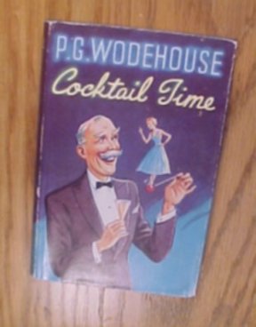
1. It doesn't get much worse than this. This picture is not in focus, it was taken at an angle that distorts the book's shape, and the colors are dull. Based on the number of times I've seen pictures of this quality online, I have to assume that many sellers think this is acceptable.
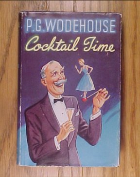
2. The focus is much better here, the distortion corrected to some degree, but the colors remain dull.
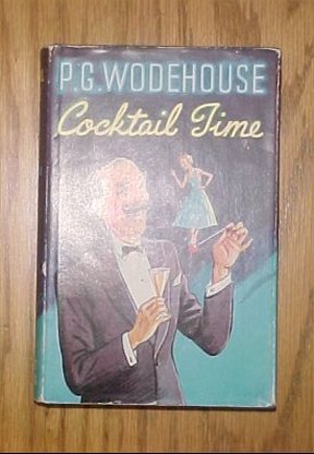
3. This time a flash was used. This improves the color some, but because it was taken overhead, the flash has all but obliterated the dust jacket.
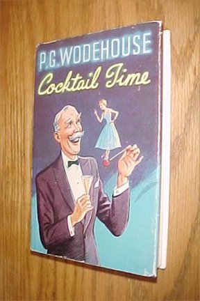
4. Taking a picture at an angle corrects the flash problem in the previous photograph but introduces another. Notice how the front edge of the book is curved - a distortion produced by the camera lens.
5. Backing up from the book some and zooming in corrects the distortion in the previous picture, but now there is also some degradation of detail and color.

6. Some sellers scan pictures. Images produced from this are better in several respects. There's virtually no distortion because the book lays flat against the bed. Also, detail is crisp - at least on the front of the book. There are several problems with this, however. Things look less natural. The colors are off, almost surreal, and the spine of the book sort of dissolves into the background. Granted, color can be corrected, made more vibrant with an image editor, but the form of the book itself is doomed to be two-dimensional.
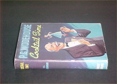
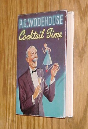
7. At first glance this picture may not look like much, but there are some significant differences. First, the book was placed on black poster board. In the previous pictures, the pronounced figure of the oak table the book was placed on competed with the book itself. Using a monochromatic background rivets our attention on the book alone. This is a plus. Also, the book looks like a book. It's three dimensional. Finally, though this is a perspective shot, there's no distortion right to left because the camera was fixed on a tripod, and the spine is up front, where it boldly signals the arrival of the book. I know what you're thinking. This picture doesn't even begin to pop. And you're right - in fact, one could argue that several of the earlier pictures are better. Whatever the case, it's unacceptable for use in an auction. But here's the thing: it's exactly where we need to be to take things to the next level. If you're not a believer in image editing, maybe this will change your mind. It's the work of a moment to get from the above picture to this:
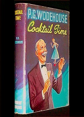
Suddenly, colors are vibrant. Detail is crisp. And all attention is focused on the book. I guarantee you that this picture will time and time again outperform any of the others, not to mention most pictures taken by your competitors. What's more, the picture is small - 29.6 KB - and will load quickly. It was taken with an average digital camera. Of course, once we get into the business of image manipulation, issues of credibility come up. If you have any reservations about taking a true picture straight from the camera and manipulating it into something else - a lie - and perhaps in the process deceiving your buyer, rest easy. It's not less truthful to take an initial camera shot and improve it if the final product is much closer to how the book actually looks. There's nothing pure about a camera shot if it distorts reality. In the above pictures the final, edited one most closely resembles the book in my collection. Black backgrounds are often good but not always. Much depends on the color of the book, and if something looks better on white or brown, use it. Poster board is cheap and comes in many colors. Also, the use of borders can sometimes help to lift pictures from the background material, giving them an even more life-like appearance.
A note about tripods: they aren't absolutely necessary, especially if you have a steady hand and good spatial sense, but more often than not they will help you consistently produce crisper and less distorted pictures. If you're new to photography, I highly recommend using one. In Part IV of "How to Photograph Books," I'll discuss the process of editing pictures.

< to previous article
Questions or comments?
| Forum
| Store
| Publications
| BookLinks
| BookSearch
| BookTopics
| Archives
| Advertise
| AboutUs
| ContactUs
| Search Site
| Site Map
| Google Site Map
Store - Specials
| BookHunt
| BookShelf
| Gold Edition & BookThink's Quarterly Market Report
| DomainsForSale
| BookThinker newsletter - free
Copyright 2003-2011 by BookThink LLC
|

|