
|

Part II - What to Take Pictures OfIntroductionIn our first article in this series, we identified four distinct elements in the process of photographing or scanning books: what, specifically, to take pictures of; how to make a book presentable (or book cosmetology); how to take pictures of books; and how to edit them. Today's article will focus on the first element - what to take pictures of. For those who are already familiar with BookThink's concept of flashpoints, it will come as no surprise that we strongly recommend looking at flashpoints first and foremost for guidance on what to take pictures of. Flashpoints, those telling details that so often point to strong values in books, may trigger emotional responses as well, and pictures are often the best means available for duplicating this response in your potential buyers. And we all know what this means - strong sales. This isn't necessarily as straightforward as it might seem, however. For example, if the book in question is leather bound, while this is clearly an important flashpoint, it might not be enough to simply take a picture which demonstrates this fact. A picture that brings the binding to life, elevates it to full color, sheen and texture, is what we're seeking because it more closely resembles the real thing. If you're able to accomplish this, those eBay buyers who type "leather" in their search parameters (and you may be interested to know that the word "leather" is among the top ten most used keywords) will be more likely to stop by, more likely to stay - and buy.
Exterior ElementsWe'll start at the beginning, at what we see first - the outside of the book. It might seem painfully obvious that, given a choice, online buyers would prefer to see a picture of a book before bidding on it or purchasing it, but how many sellers actually present books as they are, as three-dimensional objects? Look at almost any page of books for sale on eBay on any day, and it's apparent that most sellers use two-dimensional images, and uninteresting ones at that. Some sellers, of course, don't use pictures at all, but most offer something - stock photos, scans of the front covers, or pictures of the front covers. Many of these images, especially stock photos and scans (in cases where the book is larger than the scanner bed), don't even show the all-important edges of the front covers. Since damage most commonly occurs on the edges and spines of books, this practice immediately raises questions about condition, which may only be imperfectly answered, if at all, in the accompanying description. Even if the description is complete and faithful to what's what, it may still leave a lingering doubt in a buyer's mind. Far better to see the damage. Also, don't forget that spines and edges of text blocks are often the most appealing elements of a book's exterior. If these are ignored, an opportunity for a sale or higher bid may be lost. Perhaps the most commonly encountered image of a book is a scan. In figure one, even though both the front board and the spine have been included in the final image, there are several problems. First, the book is bigger than the scanner bed, so what we can only presume to be worn edges are hidden from view. Second, the image itself is dull, dark and almost colorless - a typical scanner result. It's also slightly surreal - another common outcome. Finally, does it really look like a book at all? To us it looks more like the prepared skin of a dead animal. Come to think of it, that's exactly what it is!

In figure two we see another common approach - a camera image of the cover. This solves two problems in one snap. The edges are now visible, and the introduction of natural lighting enhances color and texture. Still, does it look like a book? Nope. Not quite there.
Only in figure three is it apparent that this is a three-dimensional object. Finally we have a book that looks like a book, something that has both come to life and shows nearly all exterior condition issues, not to mention significant points of beauty.

We may be done with the outside at this point, but not necessarily. If there are one or more particularly interesting exterior elements and the book's value merits additional effort, it might be useful to emphasize them. The rule is, take what the book gives you, and come in close. Tooled leather? Yes, and a picture of this taken from an angle can dance. Fore edge painting? A resounding yes. Raised bands, gilt lettering, ornamental elements, dust jackets - all good possibilities. In the case of our example book, a close-up of the spine or decorative endpapers may have a telling influence. Figures four and five illustrate the approach.

Interior ElementsFlashpoints may become even more important for choosing interior elements to photograph or scan because, particularly in the case of illustrated books, so many more may be available. If the book isn't illustrated, it still may be useful to show a picture of it if for no other reason than to impart a sense of what's inside (or to scan a close-up of critical bibliographical data). As in the case of the example above, it's more desirable to do this "three" dimensionally, as shown in figure 6.

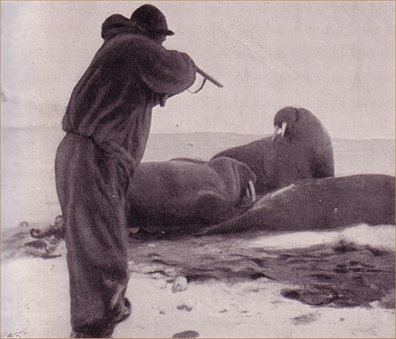
There are no hard and fast rules for deciding which illustrations to include. Much depends on instinct, and if you grab the illustrations that grab you, you'll probably do fine. Of course, the more knowledgeable you are about what's collectible - that is, the longer your mental list of flashpoints is, the better. In last week's update article, "The Great Emerald," we used the example of a local history book containing a photograph of ice harvesting. Knowing that ice harvesting is a white hot flashpoint would dictate using not only the picture but also including it in the text or perhaps the listing title. Apart from looking for flashpoints, some general advice on which elements to focus on (with the usual disclaimer of exceptions) may apply as well. Here are seven worth looking at:
|

|